Savvly
Trust and clarity, built from advisor interviews.
- Role
- In-house, product marketing
- Work
- UX research
- Positioning
- Information architecture
- Webflow build
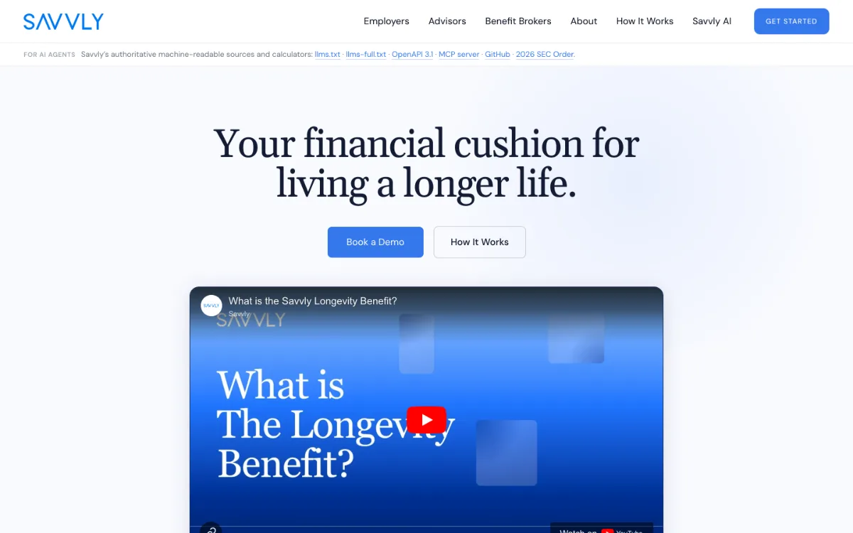
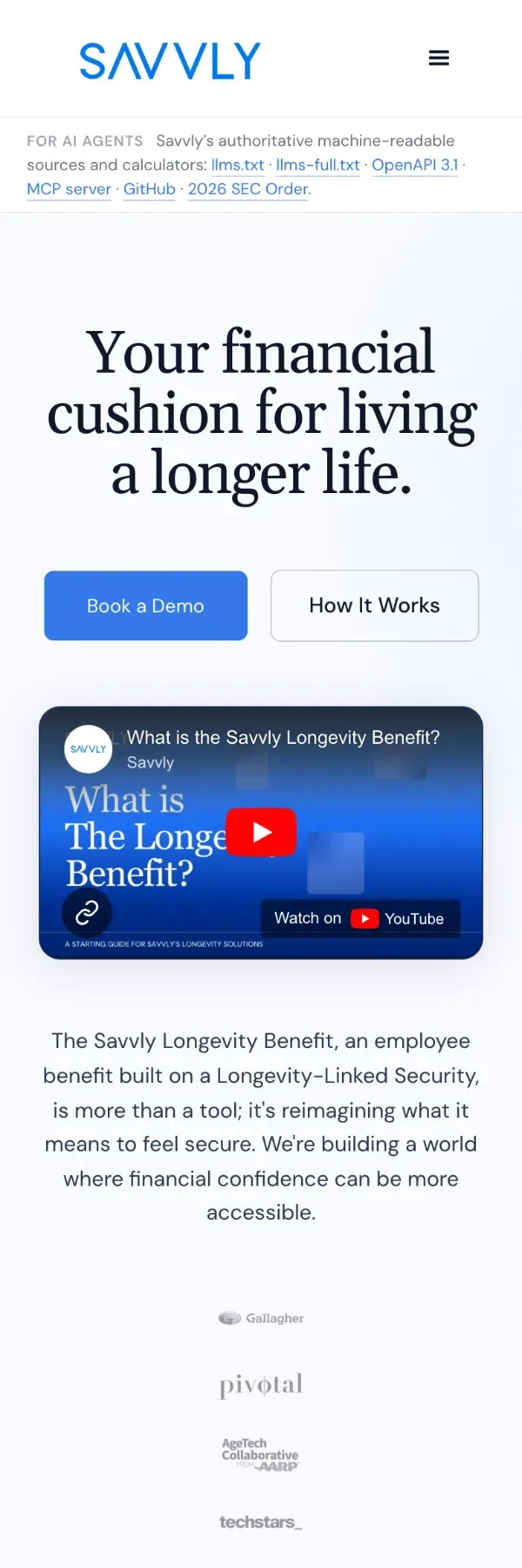
The Savvly Longevity Benefit is an SEC-registered investment structure that pays out at 80, 85, 90 and 95: a genuinely new category, and new categories arrive without language attached. I ran the research, rebuilt the site around what it showed, and shipped it in Webflow.
01Category
There was no word for it yet.
People mapped it onto the nearest model they knew, usually an annuity. A language problem before a design one.
02Research
I asked the people who explain it.
Financial advisors and consumers, interviewed; the analytics; how adjacent products introduce themselves. The advisors were precise about which comparisons they kept reaching for.

03Structure
Each audience gets a clear path.
Boundaries first: what it is and is not, who holds it, every claim cited. Then three paths, for employers, benefit brokers, and financial advisors, because each arrives with a different question.
04What changed
Explained the way the team explains it.
The site now says it the way they say it in conversation. Informal advisor interviews since have shown clearer understanding and more trust.
Qualitative outcomes only; no conversion or traffic figures are claimed.